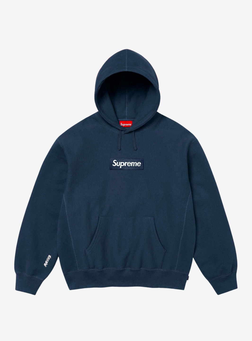
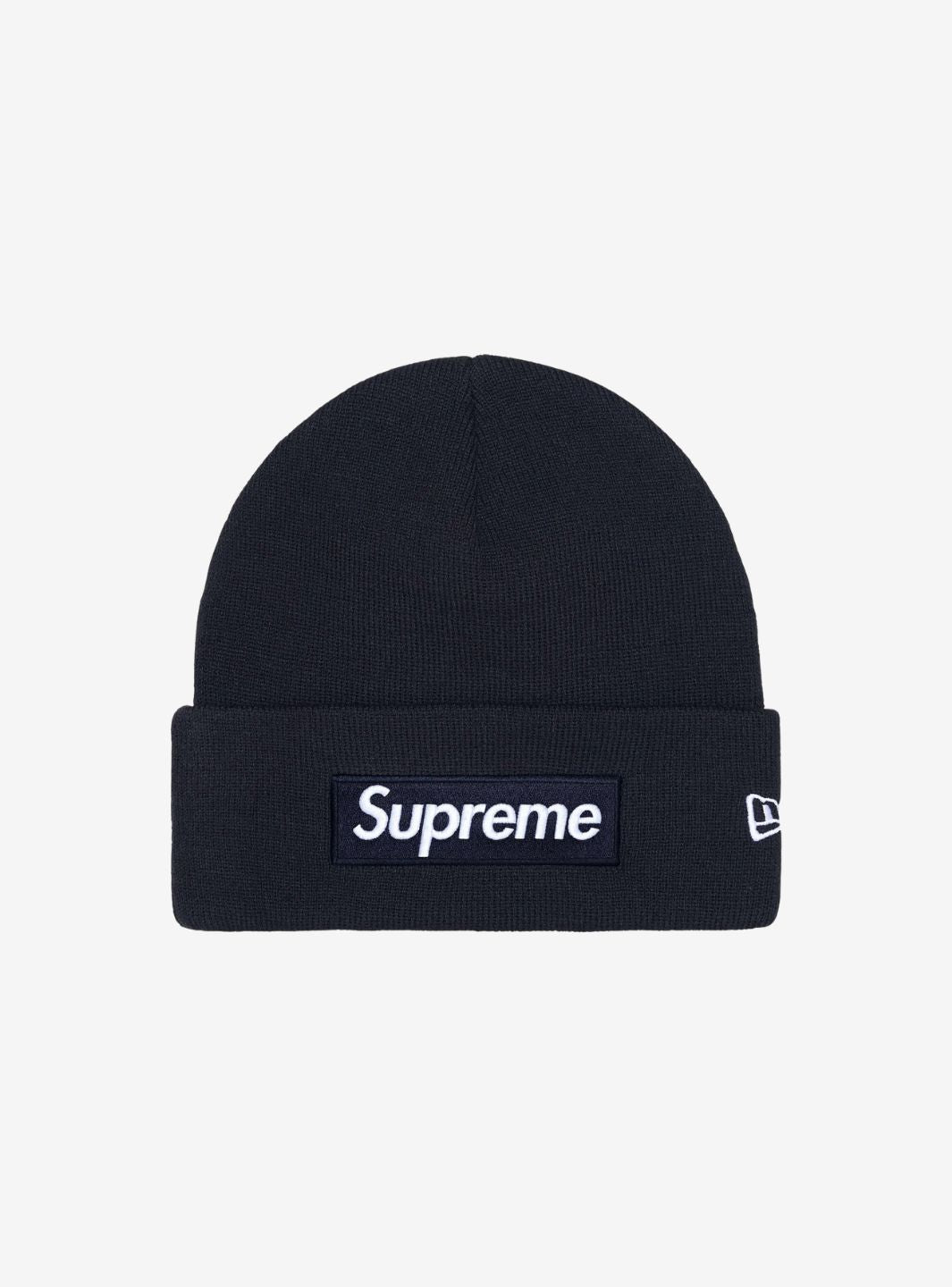
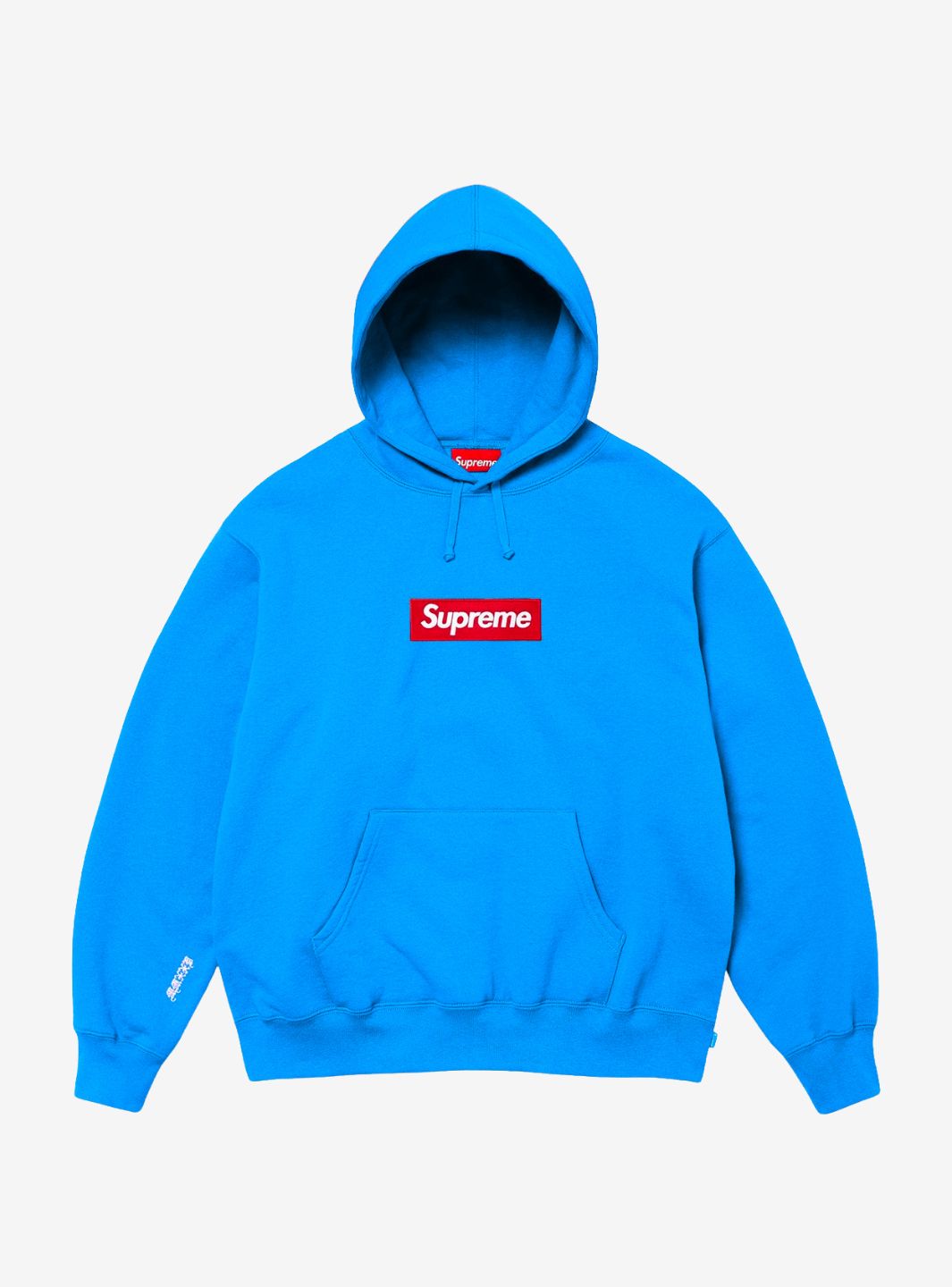
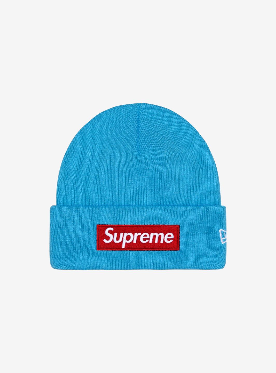
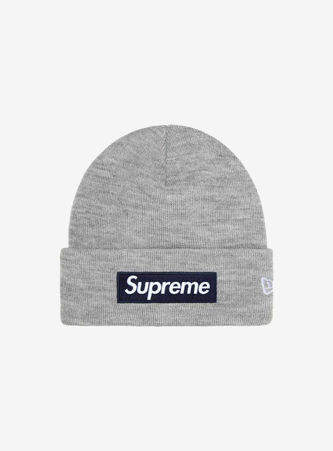
A rectangle, a word, and two colors were enough to create one of the most recognizable symbols in streetwear.
The Supreme Box Logo was born along with the brand in 1994 New York and, over the course of more than thirty years, went from being the logo of a small skate shop on Lafayette Street to becoming a recognizable element worldwide.
The structure remains almost always the same: the name Supreme inside a rectangle. What changes are the colors, patterns, materials, collaborations, and, above all, the context of the release.
This is precisely one of the most interesting aspects of the history of Supreme: the same logo has been used to celebrate anniversaries, inaugurate new stores, collaborate with artists and fashion houses, and recount completely different moments in streetwear culture.
What is the Supreme Box Logo?
The Box Logo, often abbreviated by fans as BOGO, is the rectangular logo used by Supreme since the brand's early years.
The version that became most famous uses a red rectangle with slanted white lettering, but over time Supreme has created many different interpretations of it.
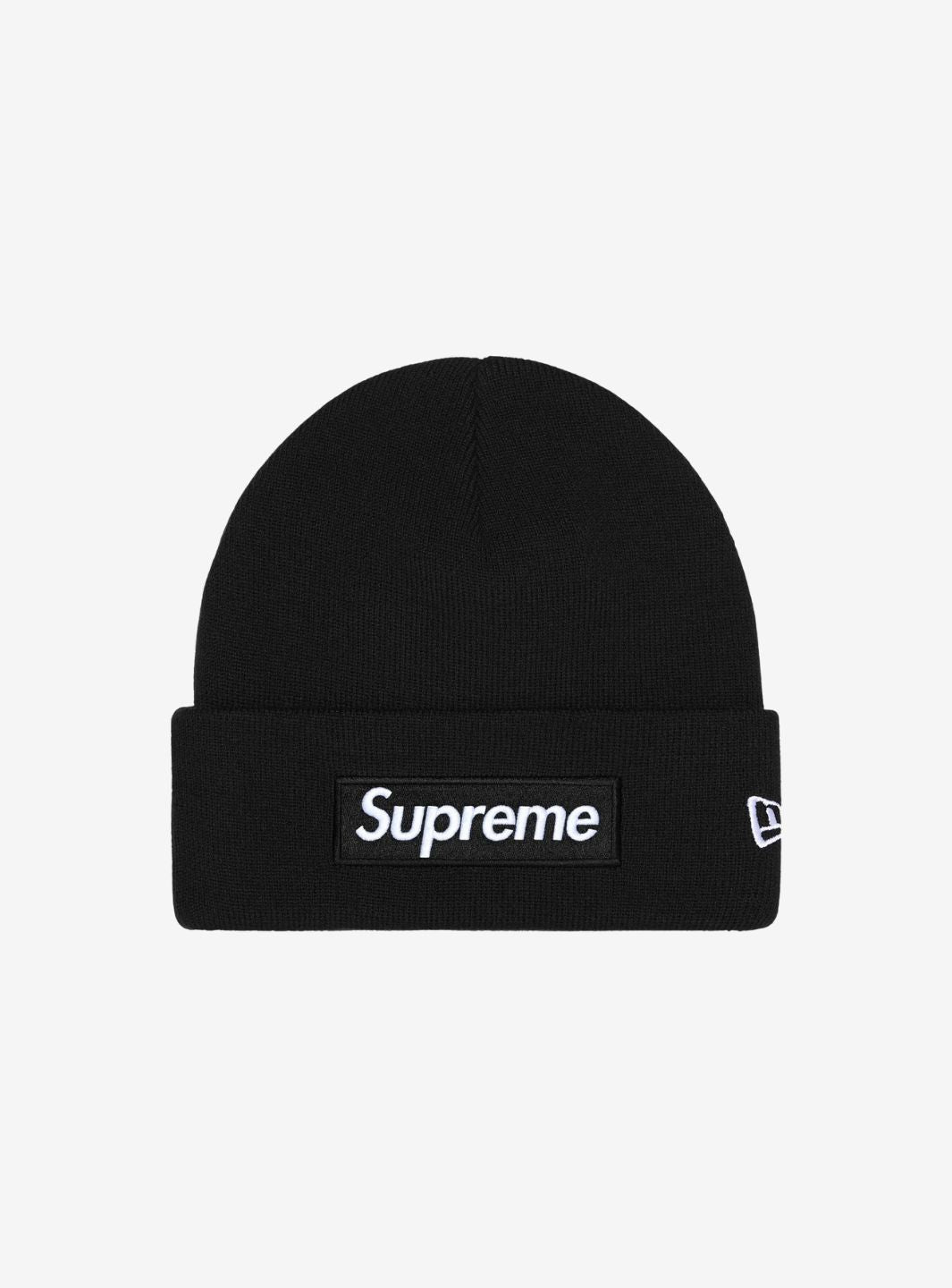
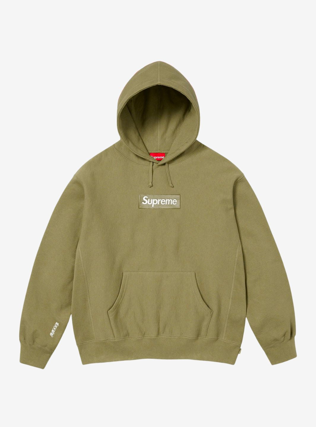
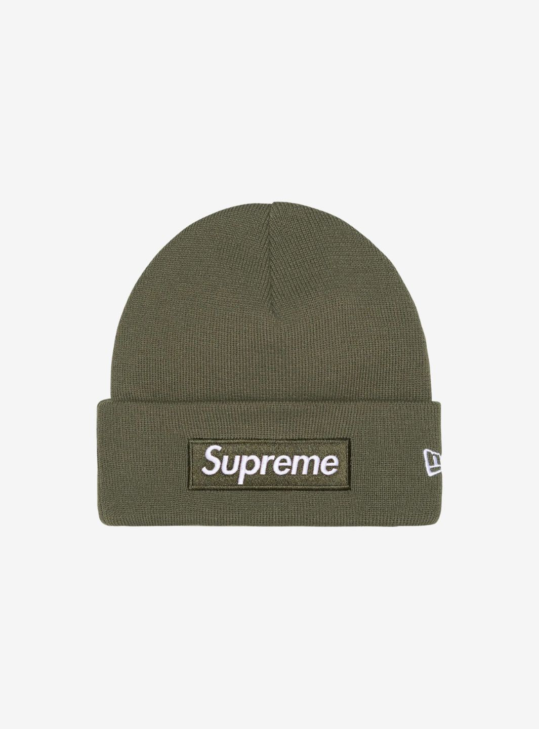
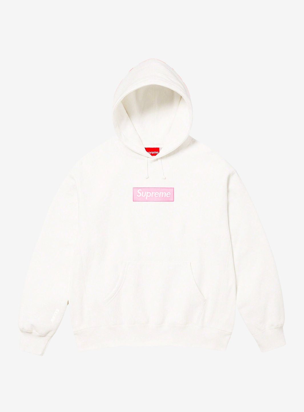
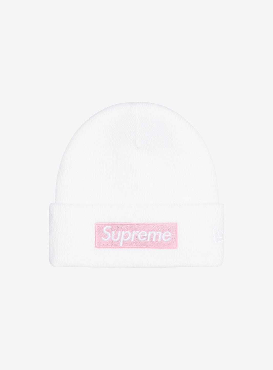
The Box Logo appears primarily on T-shirts, hoodies, crewnecks, hats, and accessories.
The interesting thing is that not all releases are limited to changing the background color.
In some cases, the rectangle is filled with patterns, artistic works, crystals, tartan, or other elements taken directly from the project with which Supreme is collaborating.
This is how an extremely simple graphic element has managed to become a creative platform.
1994: the birth of the Supreme Box Logo
The story begins in April 1994, when James Jebbia opens the first Supreme store on Lafayette Street, in downtown Manhattan.
At the beginning, Supreme is not yet the big clothing brand we know today.
It is mainly a skate shop built around the New York downtown scene, with decks, hardware, and a space designed to allow skaters to enter easily even with their boards.
Among the first products made are a few T-shirts.
One uses an image of Travis Bickle from Taxi Driver, another depicts a skater, and a third shows what would become the brand's definitive symbol: the Supreme Box Logo.
The initial productions were extremely small compared to the volumes Supreme would reach in subsequent years.
That simple white T-shirt with a red rectangle, however, would become the starting point of a story lasting more than three decades.
Barbara Kruger and the origin of the Box Logo aesthetic
To understand the Box Logo, one must also talk about Barbara Kruger.
The American artist became famous for works built through photographs, provocative texts, and a highly recognizable graphic style often based on white lettering superimposed on red backgrounds.
The visual language of the Supreme Box Logo is widely recognized as having been inspired by Kruger's work.
It is not difficult to understand why: a red rectangle, white sans-serif lettering, and an aggressive graphic layout create an immediate association with her artistic production.
Supreme, however, takes that language and brings it into a completely different context: first to skateboarding and the streets of Manhattan, then to clothing, music, art, and fashion.
It is therefore important to avoid simplification: the Box Logo does not come from nothing, but belongs to a long tradition of appropriation, remixing, and reinterpretation of images, which is also central to skate and streetwear culture.
Why did the Supreme Box Logo become so famous?
Success does not depend solely on the design.
A red rectangle with white writing, taken on its own, would not be enough to explain why the Box Logo has reached such importance.
What makes it powerful is above all the context built around Supreme.
For years, the brand distributed relatively limited quantities of product through periodic drops, avoiding making its most recognizable items always available.
The Box Logo thus became something you couldn't just buy at any time.
Each new version was linked to a specific season, city, anniversary, or collaboration.
Scarcity and the link to a specific cultural moment gradually transformed the logo into a symbol of belonging to the Supreme community.
T-Shirts and hoodies: why the Box Logo changes completely
Two of the most important mediums in the history of the BOGO are the T-shirt and the hoodie.
On the tee, the logo is normally printed and retains a very clean graphic presence.
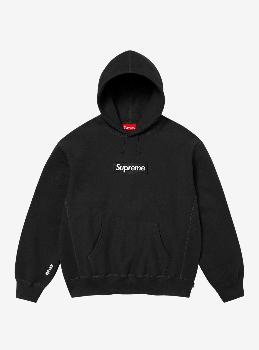
On hoodies, however, Supreme has often used an embroidered Box Logo, turning the rectangle into a more textured and structural element.
It is also for this reason that Box Logo Hoodies have over time become one of the brand's most recognizable items.
The same symbol can therefore take on a very different identity simply by changing the garment, material, color, or production technique.
The most iconic Supreme Box Logo releases
It is practically impossible to create a definitive list: Supreme has made many variants, collaborations, store opening tees, and special editions.
Some releases, however, represent particularly important moments in the history of the logo.
| Year | Box Logo | Why it's important |
|---|---|---|
| 1994 | Original Box Logo Tee | The starting point of the Supreme story |
| 2014 | 20th Anniversary | A direct return to the original 1994 design |
| 2017 | Supreme x Louis Vuitton | The symbolic encounter between streetwear and luxury |
| 2019 | Swarovski Box Logo | 25th anniversary celebrated with thousands of crystals |
| 2019 | Bandana Box Logo | The classic rectangle reinterpreted through paisley |
| 2020 | Takashi Murakami Charity Box Logo | Art and charity during the pandemic |
| 2021 | Milan Box Logo | The first official Supreme opening in Italy |
| 2021 | Supreme x Tiffany & Co. | Tiffany Blue enters the BOGO language |
| 2022 | Supreme x Burberry | The Box Logo meets the famous British check |
2014: the 20th Anniversary Box Logo
In 2014, Supreme celebrated twenty years since the opening of the Lafayette Street store by doing something very simple: returning to the beginning.
The brand re-released two of the T-shirts that had accompanied its 1994 debut: the Box Logo and the Taxi Driver Tee.
The message is significant.
After twenty years of collaborations, graphics, and international growth, Supreme demonstrated that its most important symbol does not need to be completely redesigned.
The original Box Logo continues to work precisely because it remained visually simple.
2017: Supreme x Louis Vuitton changes the perception of streetwear
In 2017, one of the most important moments in the entire history of Supreme took place.
Louis Vuitton presented an official collaboration with the New York brand on its menswear runway.
The union seemed almost paradoxical considering how distant the two worlds appeared, at least on the surface: one was born from European luxury luggage, the other from a downtown Manhattan skate shop.
The collection blended their respective graphic systems through the LV monogram and Supreme branding.
It is one of the moments in which the Box Logo definitively ceased to be perceived only as a skatewear element and became part of the international luxury fashion dialogue.
The lines in front of the pop-ups and the enormous media attention that accompanied the release showed how profoundly the relationship between luxury and streetwear was changing.
2019: Swarovski celebrates 25 years of Supreme
For the 25th anniversary, Supreme chose a completely different reinterpretation.
In 2019, the classic Box Logo was created using hand-applied Swarovski crystals.
The T-shirt version used 1,161 crystals, while the hoodie used 1,201.
The choice was almost the opposite of the original 1994 aesthetic: a symbol born on a simple skate tee was transformed into an extremely elaborate and brilliant object.
And it is precisely this contrast that makes the release particularly significant in the history of the Box Logo.
2019: the Bandana Box Logo
In the same year came another interpretation that became immediately recognizable: the Bandana Box Logo.
The classic rectangle was filled with a paisley pattern inspired by bandanas, keeping the logo structure intact but completely changing its texture.

The Supreme Bandana Box Logo Hoodie Heather Grey shows well how a simple variation of the rectangle can modify the identity of the entire garment without immediately losing Supreme recognizability.
2020: Takashi Murakami and the Charity Box Logo
In April 2020, Supreme collaborated with Takashi Murakami for a Box Logo Tee intended to support HELP USA during the COVID-19 emergency.
The Japanese artist inserted his famous floral and skull motifs into the rectangle, contaminating one of the most minimalist symbols of streetwear with his own extremely colorful universe.
The project was distributed online in the United States and Canada, and 100% of the proceeds were donated to HELP USA.
It is an important release because it shows how the Box Logo can become not only branding or a collector's item, but also support for a charitable project linked to a specific historical moment.
2021: the Supreme Milan Box Logo
For ResellZone, this is inevitably one of the most interesting chapters.
In May 2021, Supreme opened its first official Italian store in Milan.
As happened with other international openings, the brand created a T-shirt dedicated to the city.
The graphic uses a reinterpretation of the Last Supper, a work indissolubly linked to Milan, with the Box Logo superimposed on the image.
On the back appears the word “GRAZIE”.

The Supreme Milan Box Logo T-Shirt is therefore much more than a normal color variation: it physically represents the official arrival of the brand in Italy.
2021: Supreme x Tiffany & Co.
In the same year, Supreme collaborated with another symbol of New York: Tiffany & Co.
The partnership brings into dialogue two entities born in completely different eras but both deeply linked to the city.
The Box Logo takes on the immediately recognizable shade associated with Tiffany, replacing the classic red with light blue.

The Supreme Tiffany & Co. Box Logo T-Shirt perfectly demonstrates how much the rectangle can absorb the visual identity of another brand while still remaining immediately Supreme.
2022: Supreme x Burberry
In 2022, the mechanism was applied to another historical graphic code.
Supreme collaborated with Burberry and brought the famous British check inside the Box Logo.

The Supreme x Burberry Box Logo T-Shirt summarizes well the logic of many Supreme collaborations: instead of eliminating the identity of one of the two brands, the respective codes are superimposed.
The result is simultaneously recognizable as Supreme and as Burberry.
The Box Logos dedicated to store openings
A separate chapter is represented by the store opening Box Logos.
Over time, Supreme has used the opening of new locations to create T-shirts linked directly to the host city.
This has produced some of the most interesting variants of the logo: from the Hebrew lettering linked to the Los Angeles opening to the London Union Jack, the graphic dedicated to Paris, and the aforementioned Milan Box Logo.
In these cases, the T-shirt functions almost like a document of the brand's geographical growth.
Each opening adds a new chapter to the Supreme story, and the Box Logo becomes the most recognizable souvenir of that moment.
Why are some Supreme Box Logos worth much more than others?
There is no standard value for a Box Logo.
The price on the secondary market depends on numerous factors:
- year of release;
- quantity produced;
- collaboration;
- store or geographical area of distribution;
- size;
- condition of the garment;
- presence of original packaging or elements;
- collector demand.
An old T-shirt produced in very few copies can therefore be much rarer than a Box Logo belonging to a recent season.
Similarly, a particularly important collaboration can maintain strong interest even years after the release.
For this reason, it is better to speak of a single release rather than stating generically that “Box Logos are worth a lot.”
Classic Box Logo or collaboration: what changes?
Classic releases generally maintain the focus on the Supreme identity.
The color of the hoodie, the shade of the embroidery, or the color combination of the rectangle may change, but the star remains the logo itself.
Collaborations, on the other hand, add a second layer of interpretation.
Burberry inserts the check, Tiffany brings its own color, Louis Vuitton blends monogram and branding, Murakami transforms the rectangle through his own artistic language.
It is this flexibility that allows the Box Logo to be continuously reinterpreted without losing its structure.
Supreme Box Logo and collecting culture
Over time, the BOGO has also become a true archival item.
There are collectors who seek specific versions, old store opening tees, artistic variants, or entire series produced in a certain era.
The reason is simple: by looking at the Box Logos chronologically, it is possible to reconstruct an important part of the brand's history.
Each version can signify a collaboration, a city, an artist, an anniversary, or a specific moment in Supreme's growth.
In this sense, collecting Box Logos means also collecting fragments of streetwear history.
Where to find Supreme Box Logos
Today, there are Box Logos belonging to very different seasons and periods, from the simplest versions to collaborations that have become true collector's releases.
The Supreme Box Logo selection on ResellZone brings together T-shirts, hoodies, beanies, and other items from different seasons, so as to keep the search for Box Logos separate from the rest of the Supreme catalog.
Why is the Box Logo still important after over thirty years?
The Supreme Box Logo works because it manages to do two seemingly opposite things.
On one hand, it almost never changes in its fundamental structure: a rectangle and the word Supreme.
On the other, it continues to change through colors, artists, materials, collaborations, and cities.
The original 1994 version, the return for the twentieth anniversary, Louis Vuitton, Swarovski, Murakami, Milan, Tiffany, and Burberry belong to completely different periods, yet they remain immediately linkable to the same symbol.
This is probably the true strength of the Box Logo.
It is not just Supreme's logo: it has become a canvas upon which the brand has recorded over thirty years of skate culture, art, fashion, collaborations, and shifts in streetwear.